Code
# |echo: false
import pandas as pd
import numpy as np
import networkx as nx
import matplotlib.pyplot as plt
from random import randint
import pymysql
from sqlalchemy import create_engine
from sqlalchemy import textThere are multiple types of actors and interactions within the Code.gov network. We generate multiple networks (Contributor, Project, Agency) and analyze structural features of these networks. Key guiding questions for our analysis:
What are the overall structural features of the OSS networks?
How do they differ across fields, sectors, institutions and countries?
What are different communities that can be identified using structural features?
Do they correspond to similarities in languages, methods, location, culture?
A Contributor Network is generated with un-directed edges between individual contributors (GitHub users) each time they contribute to the same project (repository) with edge weights measuring frequency of collaborations.
A summary of the data used for the network analysis is presented below:
| Data Item | Magnitude |
|---|---|
| Number of Contributors | 35473 |
| Number of Projects | 6047 |
| Number of Agencies | 18 |
An edgelist was created from a table of GitHub contributors to populate the network nodes and edges. The code below shows the process of creation of edgelist for the Contributor Network.
 # Query to fetch all records

import pandas as pd
from sqlalchemy.sql import text
sql = '''
    SELECT * FROM codegov_edge_combos;
'''
with engine.connect().execution_options(autocommit=True) as conn:
    query = conn.execute(text(sql))
df_combos = pd.DataFrame(query.fetchall())

# Function to create combinations of edges with 'source' and 'target'

from itertools import combinations

def get_combinations(group):
    return pd.DataFrame([sorted(e) for e in list(combinations(group['login'].values, 2))], columns=['source', 'target'])

# Applying the function

df_check = df_combos.groupby('slug').apply(get_combinations)

# Obtaining 'weights' for edges

df_check = df_check.groupby(['source', 'target']).size().to_frame('weight').reset_index()

# Edgelist completeNodes: A node represents each individual contributor or GitHub user contributing to repositories on GitHub associated with Codegov software projects.
Edges: Each edge in the network represents a link between two contributors on GitHub where an edge is formed each time the pair of these two contributors work on the same GitHub repository associated with a Codegov project.
Weights: The weights of edges represent the number of times a pair of contributors/GitHub users (nodes) collaborate on the same GitHub repository (software project).
# |echo: false

import pandas as pd
import numpy as np
import networkx as nx
import matplotlib.pyplot as plt
from random import randint
import pymysql
from sqlalchemy import create_engine
from sqlalchemy import text# | echo: false
# Credentials to database connection
hostname="oss-1.cij9gk1eehyr.us-east-1.rds.amazonaws.com"
dbname="codegov"
uname="jdpinto"
pwd="DSPG2023"
# Create SQLAlchemy engine to connect to MySQL Database
engine = create_engine("mysql+pymysql://{user}:{pw}@{host}/{db}"
.format(host=hostname, db=dbname, user=uname, pw=pwd))
sql = '''
SELECT * FROM codegov_edgelist_users;
'''
with engine.connect().execution_options(autocommit=True) as conn:
query = conn.execute(text(sql))
df_combos = pd.DataFrame(query.fetchall())
df_combos.replace('',np.nan,regex = True, inplace=True)
df_combos.dropna(subset=['source'], inplace=True)
G = nx.from_pandas_edgelist(df_combos, edge_attr=True)To get a better sense of the data we start by visualizing the graph. Below we use the random_layout function from networkx to get a quick visualization of the graph.
fig, ax = plt.subplots(figsize=(25, 12))
ax.axis("off")
(0.0, 1.0, 0.0, 1.0)plot_options = {"node_size": 0.1, "with_labels": False, "width": 0.01}
nx.draw_networkx(G, pos=nx.random_layout(G), ax=ax, **plot_options)
plt.show()
With the random_layout we get a graph visualization with overlapping edges resulting in a visualization that is difficult to interpret and to impose a structure on. Therefore we use the spring_layout function which uses information about the nodes and edges to compute locations for the nodes.
pos = nx.spring_layout(G)
plot_options = {"node_size": 10, "with_labels": False, "width": 0.15}
fig, ax = plt.subplots(figsize=(15, 9))
ax.axis("off")
(0.0, 1.0, 0.0, 1.0)nx.draw_networkx(G, pos=pos, ax=ax, **plot_options)
plt.show()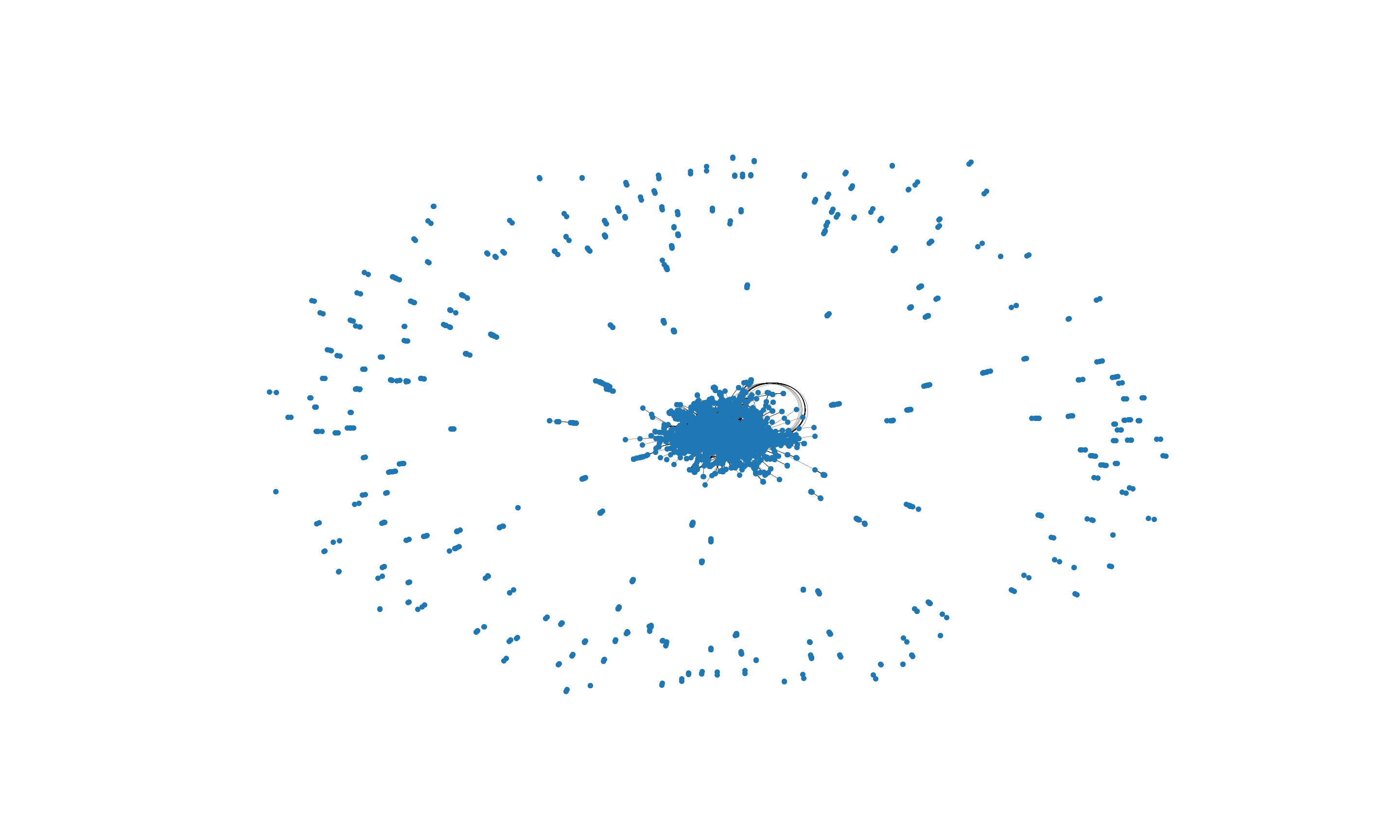
The visualization above is more useful for our analysis. We can glean an overall structure of the network, many of the nodes are concentrated in the center with a spread of nodes around the main central cluster. In subsequent analysis below we will look deeper into the clustering tendency of the network.
G.number_of_nodes()17185G.number_of_edges()2575859np.mean([d for _, d in G.degree()])299.7799243526331The average degree of a node is 299.77 (add median, mode, distribution, degree distribution, power law and skewness)
This implies that, on average, each node is connected to approximately 300 other nodes (neighbors)
degree_sequence = sorted((d for n, d in G.degree()), reverse=True)
dmax = max(degree_sequence)

fig, (ax1, ax2) = plt.subplots(1, 2)
fig.suptitle('Degree of Contributor Network')

plt.subplot(1,2,1)
plt.plot(degree_sequence, "b-", marker="o")
plt.title("Degree Rank Plot")
plt.ylabel("Degree")
plt.xlabel("Rank")

plt.subplot(1,2,2)
plt.bar(*np.unique(degree_sequence, return_counts=True))
<BarContainer object of 592 artists>plt.xscale("log")
plt.title("Degree Histogram")
plt.xlabel("Degree")
plt.ylabel("# of Nodes")
fig.tight_layout()
plt.show()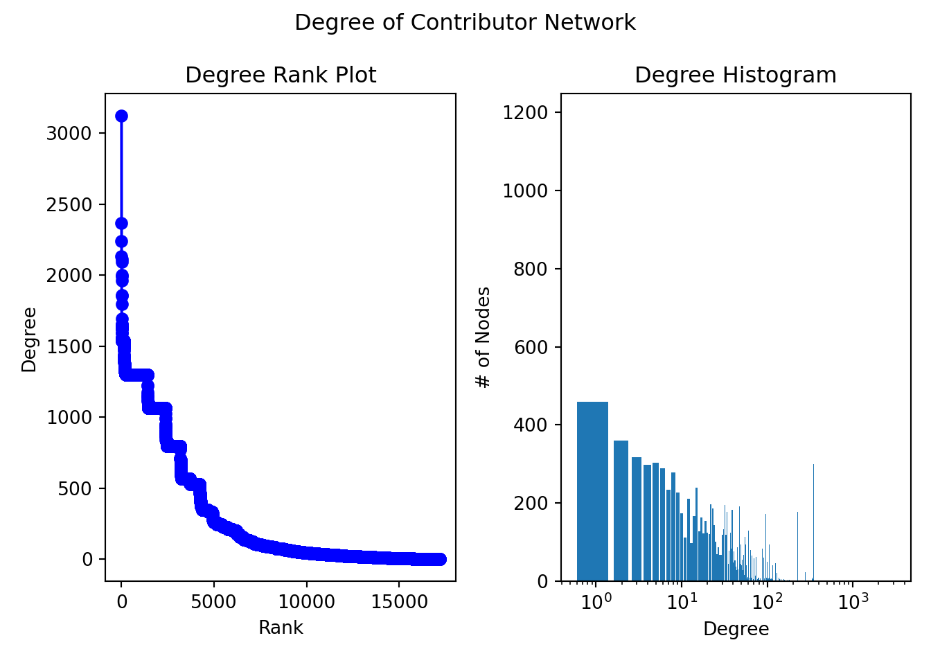
nx.is_connected(G)Falselargest_cc = max(nx.connected_components(G), key=len)
len(largest_cc)16116Gcc = sorted(nx.connected_components(G), key=len, reverse=True)
G0 = G.subgraph(Gcc[0])
nx.approximation.diameter(G0)10The contributor network is not connected therefore we take the largest connected component of the network and create a subgraph of this component. Subgraph of the largest component has 16,116 nodes out of a total of 17,185 nodes of the Contributor Network. We take the diameter of the subgraph below.
Properties related to the distribution of paths through the graph are represented by diameter (longest of the shortest path length) and average path length. We explore the average shortest path length between pairs of nodes.
#shortest_path_lengths_G0 = dict(nx.all_pairs_shortest_path_length(G0))Using the dictionary shortest_path_lengths we can further analyze the network by identifying the average shortest path length of the network.
# Compute the average shortest path length for each node
#average_path_lengths = [np.mean(list(spl.values())) for spl in shortest_path_lengths.values()]
# The average over all nodes
#np.mean(average_path_lengths)
For this network we can see that the average shortest path length is approximately 3, to reach any node from any other node in the graph, we will need to traverse 3 edges on average. To gain further insight on the shortest path lengths we can look at the distribution.
nx.density(G)0.017445293549385073Define connected components
nx.number_connected_components(G)233cc_list = [len(c) for c in sorted(nx.connected_components(G), key=len, reverse=True)]
cc_df = pd.DataFrame(cc_list, columns=['nodes'])
fig, ax = plt.subplots()
# the histogram of the data
n, bins, patches = ax.hist(cc_df['nodes'], density=True)
ax.set_xlabel('Number of Nodes')
ax.set_ylabel('Probability Density')
ax.set_title(r'Histogram of Components')
fig.tight_layout()
plt.show()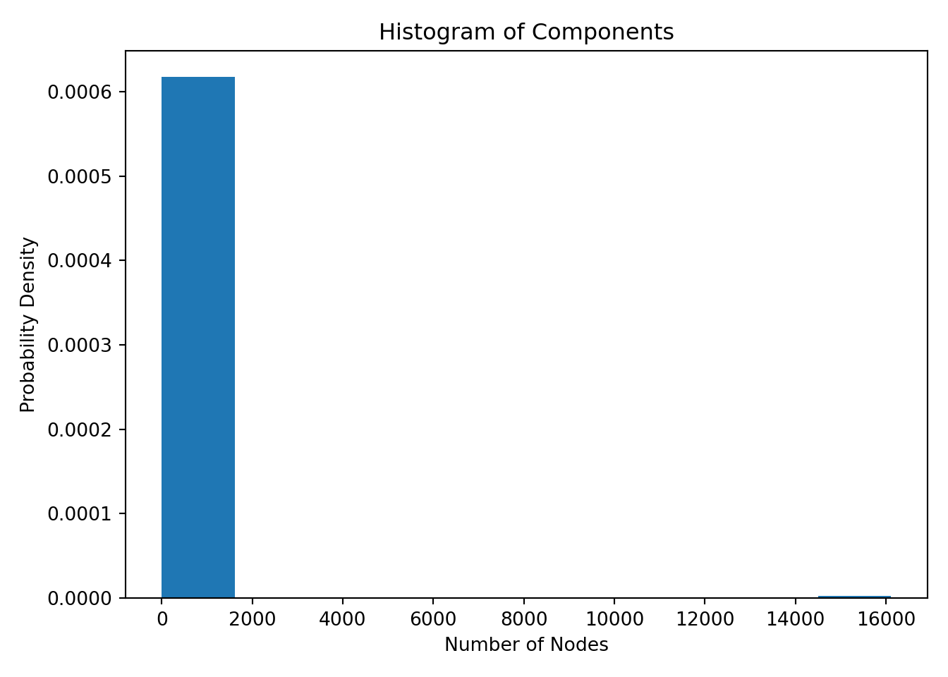
From the plot above we can see that a majority of the components have number of nodes in the 2 to 100 range and 1 component has number of nodes in the 16,000 range - this is also the largest component of the network.
We examine the centrality measures for the Contributor Network graph. Centrality measures will help us understand the Contributor network. They inform us of the importance of any given node in a network and highlight nodes that we may focus on. Each measure has a different criteria for measuring the importance of a node.
Degree centrality assigns a score to individual nodes based on the number of direct connections each node has. This is useful for us to identify actors who are highly connected and likely to hold a lot of information and who can quickly connect with the wider network.
# establishing connection and listing all tables in database
con <- dbConnect(MySQL(), user = Sys.getenv("DB_USERNAME"), password = Sys.getenv("DB_PASSWORD"),
    dbname = "codegov", host = "oss-1.cij9gk1eehyr.us-east-1.rds.amazonaws.com")


df_degree <- dbReadTable(con, "codegov_network_degree_centrality")

dbDisconnect(con)
[1] TRUE#theme_set(theme_wes())
# basic histogram
degree_hist <- ggplot(df_degree, aes(x=degree)) +
geom_histogram(binwidth=0.005) +
labs(title = "Histogram for Degree Centrality of Contributor Network",
x = "Degree Centrality",
y = "Count")
degree_hist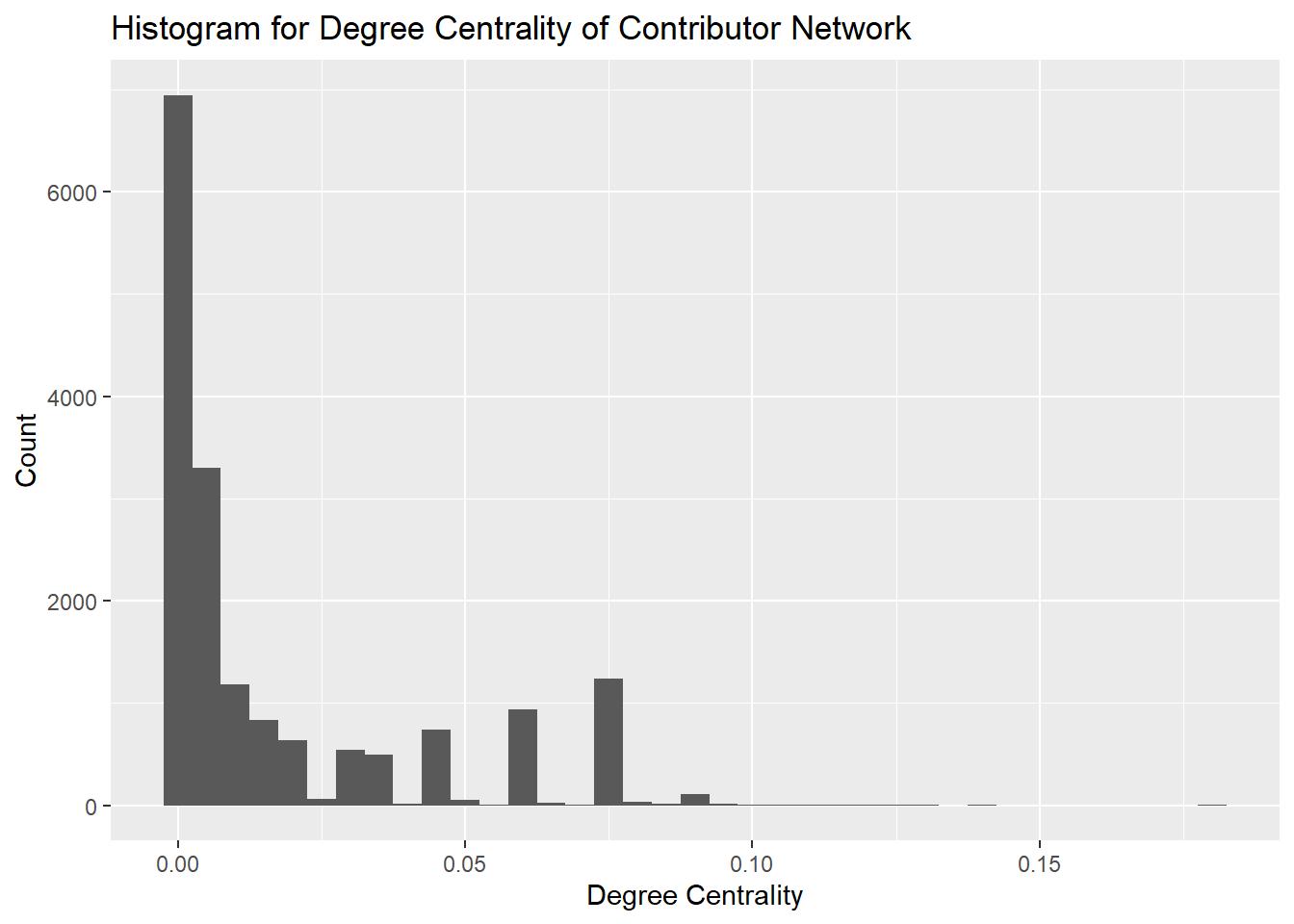
It is evident from the histogram that the majority of the contributors in the network have a degree centrality of less than 0.05. However we can also see that very few nodes have degree centrality of close to 0.10 and these are likely the nodes with a higher number of connections. We will focus on these nodes for further analysis.
Betweeness centrality provides a measure of the number of times a node lies on the shortest path between other nodes. It highlights those nodes which act as bridges between other nodes. These nodes are important to investigate because they are likely the ones which influence the flow of information in the network.
# establishing connection and listing all tables in database
con <- dbConnect(MySQL(), user = Sys.getenv("DB_USERNAME"), password = Sys.getenv("DB_PASSWORD"),
    dbname = "codegov", host = "oss-1.cij9gk1eehyr.us-east-1.rds.amazonaws.com")


df_between <- dbReadTable(con, "codegov_network_betweeness_centrality")

dbDisconnect(con)
[1] TRUE#theme_set(theme_wes())
# basic histogram
between_hist <- ggplot(df_between, aes(x=betweeness)) +
geom_histogram(binwidth=0.005) +
labs(title = "Histogram for Betweeness Centrality of Contributor Network",
x = "Betweeness Centrality",
y = "Count")
between_hist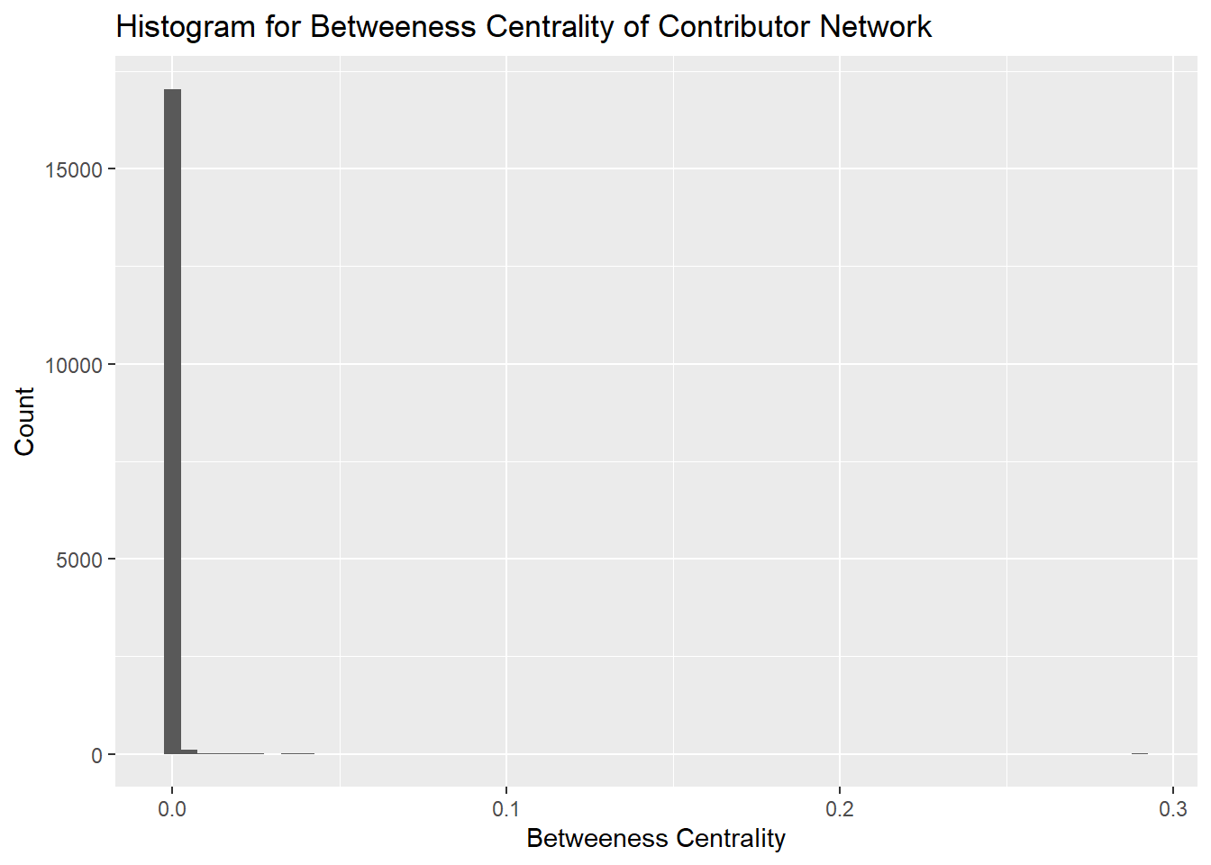
It is evident from the histogram that the majority of betweeness centrality is below 0.1. The graph is sparse and therefore most nodes do not act as bridges, further the graph is not entirely connected and therefore there are fewer nodes in between components acting as bridges.
Closeness centrality gives a score to each node based on the closeness of the node to other nodes in the network. Closeness centrality is important to evaluate the spread of information in a network. Users with higher closeness centrality are able to spread new information quickly to the network.
# establishing connection and listing all tables in database
con <- dbConnect(MySQL(), user = Sys.getenv("DB_USERNAME"), password = Sys.getenv("DB_PASSWORD"),
    dbname = "codegov", host = "oss-1.cij9gk1eehyr.us-east-1.rds.amazonaws.com")


df_close <- dbReadTable(con, "codegov_network_closeness_centrality")

dbDisconnect(con)
[1] TRUE#theme_set(theme_wes())
# basic histogram
close_hist <- ggplot(df_close, aes(x=closeness)) +
geom_histogram(binwidth=0.005) +
labs(title = "Histogram for Closeness Centrality of Contributor Network",
x = "Closeness Centrality",
y = "Count")
close_hist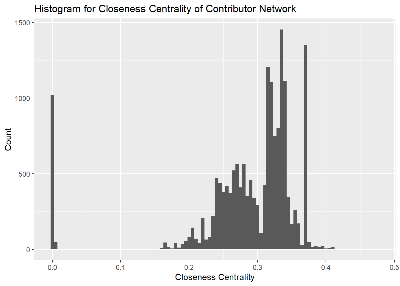
We can see that a majority of the nodes are distributed between 0.2 and 0.4 with some nodes closer to 0.0. This implies that our network is concentrated at the center with a number of nodes spread out away from the central cluster.
Eigenvector centrality is a measure to determine how a node is connected to other important nodes in the network. The influence of a node is measured based on how well a node is connected within the network and how many further links its connections have. The contributors with the highest Eigenvector centralitites are the ones that are most able to influence a network and are therefore the most important nodes in the network.
# establishing connection and listing all tables in database
con <- dbConnect(MySQL(), user = Sys.getenv("DB_USERNAME"), password = Sys.getenv("DB_PASSWORD"),
    dbname = "codegov", host = "oss-1.cij9gk1eehyr.us-east-1.rds.amazonaws.com")


df_eigen <- dbReadTable(con, "codegov_network_eigen_centrality")

dbDisconnect(con)
[1] TRUE#theme_set(theme_wes())
# basic histogram
eigen_hist <- ggplot(df_eigen, aes(x=eigenvector)) +
geom_histogram(binwidth=0.005) +
labs(title = "Histogram for Eigenvector Centrality of Contributor Network",
x = "Eigenvector Centrality",
y = "Count")
eigen_hist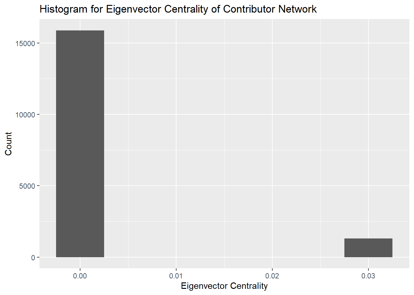
From the histogram we can see that the distribution of the Eigenvector centrality is concentrated near 0 with a few outliers near 0.03. This is a result of a few of the actors in the network having outsized influence on the network compared to other nodes. We will identify these nodes in particular for further analysis.
top20_eigen <- df_eigen |>
  top_n(20, eigenvector) |>
  slice(1:20)

top20_degree <- df_degree |>
  top_n(20, degree) |>
  slice(1:20)

top20_close <- df_close |>
  top_n(20, closeness) |>
  slice(1:20)

top20_between <- df_between |>
  top_n(20, betweeness) |>
  slice(1:20)

top20_centrality <- bind_cols(top20_eigen, top20_degree, top20_between, top20_close) |>
  rename(node_eigen=node...2, node_degree=node...5, node_between=node...8, node_close=node...11) |>
  select(-index...1, -index...4, -index...7, -index...10)

top20_centrality
The table above shows the top 20 nodes by Eigenvector, Degree, Betweeness and Closeness centralitities. We can observe that several nodes (contributors) are repeating in the table for the 4 centrality measures. For further analysis we can take the top 20 nodes for the Eigenvector centrality measure which will correlate to the top 20 most “influential” nodes.
The clustering coefficient of a node in a network represents the probability that two randomly selected nodes connected to the primary node are also connected to each other. As a result they form triangles. The closer to 1 the average clustering coefficient is of a network the more completely connected the graph will be. This also implies triadic closure because the more completely connected a graph is the more trianges will be formed.
#nx.average_clustering(G)The network has an average clustering coefficient of 0.92, this shows that the network is heavily clustered and more complete with many triangles. This is also evident from the network visualization.